pip install ppscoreRIP correlation. Introducing the Predictive Power Score.
We define the Predictive Power Score (PPS), an alternative to the correlation that finds more patterns in your data. Originally published on Towards Data Science.
Too many problems with the correlation
It is Friday afternoon and your boss tells you that the data delivery surprisingly arrived early — after only 4 weeks of back and forth. This was the missing piece for your predictive model. You’re excited but also a little bit anxious because you know what’s next: exploring the data. All. 45. Columns. This will take many hours but you know it’s worth it because without data understanding you are walking blind. One obvious step is to have a look at all the univariate column distributions. But this won’t be enough.
You ask yourself: what relationships exist between columns?
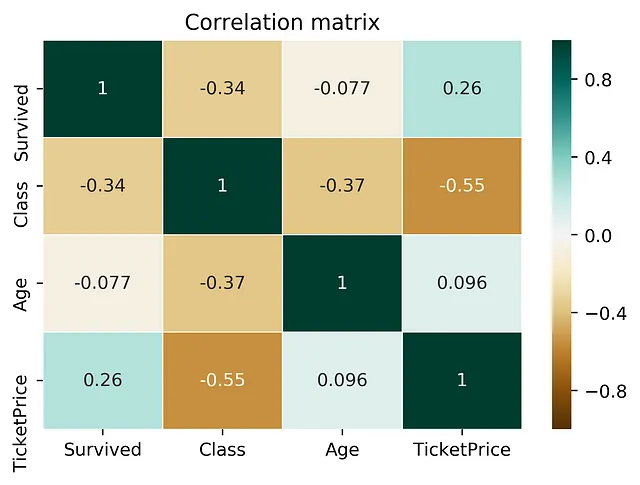
To answer this question, you just repeat the typical drill: calculate a correlation matrix and check for some surprising relationships. Whenever you are surprised, you take a moment to plot a scatterplot of the two columns at hand and see if you can make any sense of it. Hopefully you can but too often you cannot because you don’t even know what the columns mean in the first place. But this is a story for another day.
After inspecting the correlation matrix you move on and you don’t even know what you don’t know (scary).
Let’s take a moment to review the correlation. The score ranges from -1 to 1 and indicates if there is a strong linear relationship — either in a positive or negative direction. So far so good. However, there are many non-linear relationships that the score simply won’t detect. For example, a sinus wave, a quadratic curve or a mysterious step function. The score will just be 0, saying: “Nothing interesting here”. Also, correlation is only defined for numeric columns. So, let’s drop all the categoric columns. In my last project more than 60% of the columns were categoric, but hey. Never mind. And no, I won’t convert the columns because they are not ordinal and OneHotEncoding will create a matrix that has more values than there are atoms in the universe.

If you are a little bit too well educated you know that the correlation matrix is symmetric. So you basically can throw away one half of it. Great, we saved ourselves some work there! Or did we? Symmetry means that the correlation is the same whether you calculate the correlation of A and B or the correlation of B and A. However, relationships in the real world are rarely symmetric. More often, relationships are asymmetric. Here is an example: The last time I checked, my zip code of 60327 tells strangers quite reliably that I am living in Frankfurt, Germany. But when I only tell them my city, somehow they are never able to deduce the correct zip code. Pff … amateurs. Another example is this: a column with 3 unique values will never be able to perfectly predict another column with 100 unique values. But the opposite might be true. Clearly, asymmetry is important because it is so common in the real world.
Thinking about those shortcomings of correlation, I started to wonder: can we do better?
The requirements: One day last year, I was dreaming about a score that would tell me if there is any relationship between two columns — no matter if the relationship is linear, non-linear, gaussian or only known by aliens. Of course, the score should be asymmetric because I want to detect all the weird relationships between cities and zip codes. The score should be 0 if there is no relationship and the score should be 1 if there is a perfect relationship. And as the icing on the cake, the score should be able to handle categoric and numeric columns out of the box. Summing it up for all my academic friends: an asymmetric, data-type-agnostic score for predictive relationships between two columns that ranges from 0 to 1.
Calculating the Predictive Power Score (PPS)
First of all, there is not the one and only way to calculate the predictive power score. In fact, there are many possible ways to calculate a score that satisfies the requirements mentioned before. So, let’s rather think of the predictive power score as a framework for a family of scores.
Let’s say we have two columns and want to calculate the predictive power score of A predicting B. In this case, we treat B as our target variable and A as our (only) feature. We can now calculate a cross-validated Decision Tree and calculate a suitable evaluation metric. When the target is numeric we can use a Decision Tree Regressor and calculate the Mean Absolute Error (MAE). When the target is categoric, we can use a Decision Tree Classifier and calculate the weighted F1. You might also use other scores like the ROC etc but let’s put those doubts aside for a second because we have another problem:
Most evaluation metrics are meaningless if you don’t compare them to a baseline
I guess you all know the situation: you tell your grandma that your new model has a F1 score of 0.9 and somehow she is not as excited as you are. In fact, this is very smart of her because she does not know if anyone can score 0.9 or if you are the first human being who ever scored higher than 0.5 after millions of awesome KAGGLErs tried. So, we need to “normalize” our evaluation score. And how do you normalize a score? You define a lower and an upper limit and put the score into perspective. So what should the lower and upper limit be? Let’s start with the upper limit because this is usually easier: a perfect F1 is 1. A perfect MAE is 0. Boom! Done. But what about the lower limit? Actually, we cannot answer this in absolute terms.
The lower limit depends on the evaluation metric and your data set. It is the value that a naive predictor achieves.
If you achieve a F1 score of 0.9 this might be super bad or really good. If your super fancy cancer detection model always predicts “benign” and it still scores 0.9 on that highly skewed dataset then 0.9 is obviously not so good. So, we need to calculate a score for a very naive model. But what is a naive model? For a classification problem, always predicting the most common class is pretty naive. For a regression problem, always predicting the median value is pretty naive.
Let’s have a look at a detailed, fictional example:
Getting back to the example of the zip codes and the city name. Imagine both columns are categoric. First, we want to calculate the PPS of zip code to city. We use the weighted F1 score because city is categoric. Our cross-validated Decision Tree Classifier achieves a score of 0.95 F1. We calculate a baseline score via always predicting the most common city and achieve a score of 0.1 F1. If you normalize the score, you will get a final PPS of 0.94 after applying the following normalization formula: (0.95–0.1) / (1–0.1). As we can see, a PPS score of 0.94 is rather high, so the zip code seems to have a good predictive power towards the city. However, if we calculate the PPS in the opposite direction, we might achieve a PPS of close to 0 because the Decision Tree Classifier is not substantially better than just always predicting the most common zip code.
Please note: the normalization formula for the MAE is different from the F1. For MAE lower is better and the best value is 0.
Comparing the PPS to correlation
In order to get a better feeling for the PPS and its differences to the correlation, let’s have a look at the following two examples:
pps2Example 1: Non-linear effects and asymmetry

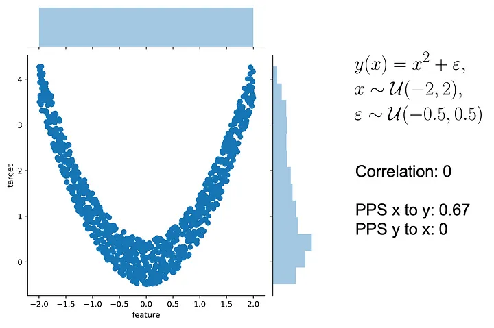
Let’s use a typical quadratic relationship: the feature x is a uniform variable ranging from -2 to 2 and the target y is the square of x plus some error. In this case, x can predict y very well because there is a clear non-linear, quadratic relationship — after all that’s how we generated the data. However, this is not true in the other direction from y to x. For example, if y is 4, it is impossible to predict whether x was roughly 2 or -2. Thus, the predictive relationship is asymmetric and the scores should reflect this.
What are the values of the scores in this example? If you don’t already know what you are looking for, the correlation will leave you hanging because the correlation is 0. Both from x to y and from y to x because the correlation is symmetric. However, the PPS from x to y is 0.67, detecting the non-linear relationship and saving the day. Nevertheless, the PPS is not 1 because there exists some error in the relationship. In the other direction, the PPS from y to x is 0 because your prediction cannot be better than the naive baseline and thus the score is 0.
Applications of the PPS and the PPS matrix
After we learned about the advantages of the PPS, let’s see where we can use the PPS in the real life.
Disclaimer: There are use cases for both the PPS and the correlation. The PPS clearly has some advantages over correlation for finding predictive patterns in the data. However, once the patterns are found, the correlation is still a great way of communicating found linear relationships.
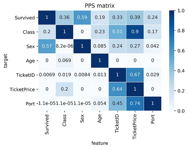
- Find patterns in the data: The PPS finds every relationship that the correlation finds — and more. Thus, you can use the PPS matrix as an alternative to the correlation matrix to detect and understand linear or nonlinear patterns in your data. This is possible across data types using a single score that always ranges from 0 to 1.
- Feature selection: In addition to your usual feature selection mechanism, you can use the predictive power score to find good predictors for your target column. Also, you can eliminate features that just add random noise. Those features sometimes still score high in feature importance metrics. In addition, you can eliminate features that can be predicted by other features because they don’t add new information. Besides, you can identify pairs of mutually predictive features in the PPS matrix — this includes strongly correlated features but will also detect non-linear relationships.
- Detect information leakage: Use the PPS matrix to detect information leakage between variables — even if the information leakage is mediated via other variables.
- Data Normalization: Find entity structures in the data via interpreting the PPS matrix as a directed graph. This might be surprising when the data contains latent structures that were previously unknown. For example: the TicketID in the Titanic dataset is often an indicator for a family.
How to use the PPS in your own (Python) project
If you are still following along you are one of the rare human beings who still have an attention span — you crazy beast! If you can’t wait to see what the PPS will reveal on your own data, we have some good news for you: we open-sourced an implementation of the PPS as a Python library named ppscore.
Before using the Python library, please take a moment to read through the calculation details
Installing the package is as simple as
Calculating the PPS for a given pandas dataframe:
import ppscore as pps
pps.score(df, "feature_column", "target_column")
You can also calculate the whole PPS matrix:
pps.matrix(df)How fast is the PPS in comparison to the correlation?
Although the PPS has many advantages over the correlation, there is some drawback: it takes longer to calculate. But how bad is it? Does it take multiple weeks or are we done in a couple of minutes or even seconds? When calculating a single PPS using the Python library, the time should be no problem because it usually takes around 10–500ms. The calculation time mostly depends on the data types, the number of rows and the used implementation. However, when calculating the whole PPS matrix for 40 columns this results in 40*40=1600 individual calculations which might take 1–10 minutes. So you might want to start the calculation of the PPS matrix in the background and go on that summer vacation you always dreamed of! 🏖 ️For our projects and datasets the computational performance was always good enough but of course there is room for improvement. Fortunately, we see many ways how the calculation of the PPS can be improved to achieve speed gains of a factor of 10–100. For example, using intelligent sampling, heuristics or different implementations of the PPS. If you like the PPS and are in need of a faster calculation, please reach out to us.
Limitations
We made it — you are excited and want to show the PPS to your colleagues. However, you know they are always so critical about new methods. That’s why you better be prepared to know the limitations of the PPS:
- The calculation is slower than the correlation (matrix).
- The score cannot be interpreted as easily as the correlation because it does not tell you anything about the type of relationship that was found. Thus, the PPS is better for finding patterns but the correlation is better to communicate found linear relationships.
- You cannot compare the scores for different target variables in a strict mathematical way because they are calculated using different evaluation metrics. The scores are still valuable in the real world, but you need to keep this in mind.
- There are limitations of the components used underneath the hood. Please remember: you might exchange the components e.g. using a GLM instead of a Decision Tree or using ROC instead of F1 for binary classifications.
- If you use the PPS for feature selection you still want to perform forward and backward selection in addition. Also, the PPS cannot detect interaction effects between features towards your target.
Conclusion
After years of using the correlation we were so bold (or crazy?) to suggest an alternative that can detect linear and non-linear relationships. The PPS can be applied to numeric and categoric columns and it is asymmetric. We proposed an implementation and open-sourced a Python package. In addition, we showed the differences to the correlation on some examples and discussed some new insights that we can derive from the PPS matrix. Now it is up to you to decide what you think about the PPS and if you want to use it on your own projects.
Github: https://github.com/8080labs/ppscore.


